Exploring Visual Tapestry: A Guide to Data Visualization Techniques
In the vast realm of data visualization, each technique is a brushstroke contributing to the masterpiece of understanding. Let’s embark on a journey through this rich palette, exploring techniques that range from the conventional to the avant-garde, each with its unique strengths and applications.
From traditional bar charts and pie graphs to more advanced heatmaps, bubble charts, and treemaps, we’ll dissect each method’s strengths and applications. We will discover when to use a line graph over a scatter plot and how to choose the right visualization for a specific dataset and intended message.
![]()
Bar Charts and Pie Graphs
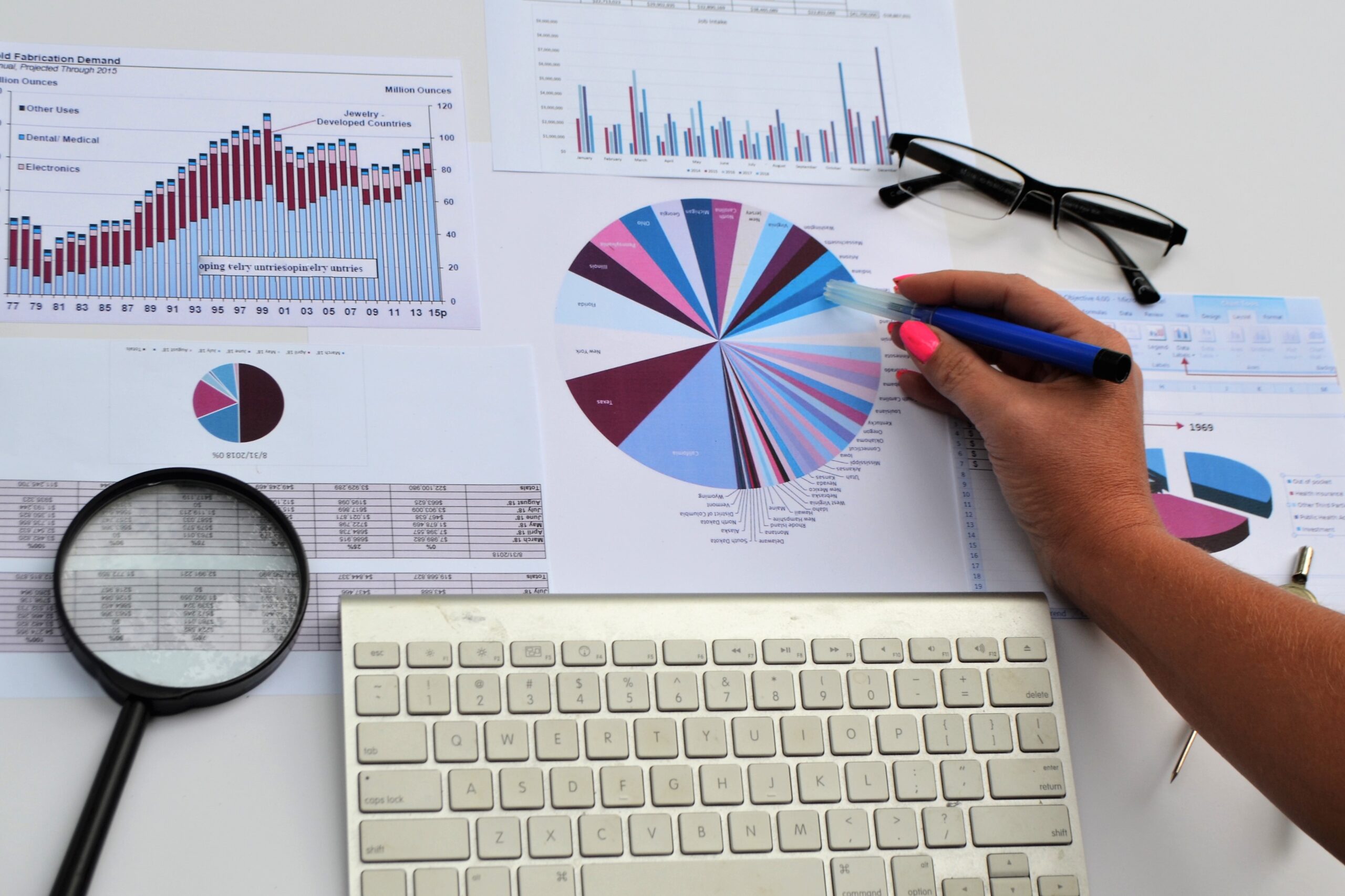
These classics are the foundation of visual representation. Bar charts effectively compare quantities, while pie graphs showcase proportional relationships. Ideal for straightforward data depiction, they provide clarity and simplicity.
Line Graphs and Scatter Plots
For trends and correlations, line graphs and scatter plots take the stage. Line graphs illustrate trends over time, making them ideal for showing patterns and fluctuations. Scatter plots, on the other hand, reveal relationships between two variables, offering insights into correlations and outliers.
Heatmaps
Enter the realm of advanced visualization with heatmaps. Perfect for displaying large datasets, heatmaps use color gradients to represent values, unveiling patterns and variations. They’re particularly effective in showcasing complex data relationships and hierarchies.
Bubble Charts
Adding a three-dimensional flair, bubble charts introduce size as a visual dimension. They excel in representing three variables simultaneously, making them ideal for exploring data with multiple dimensions and showcasing the relationships between them.
Treemaps
Navigating hierarchical structures is made visually engaging with treemaps. By dividing space into nested rectangles, treemaps present complex data relationships, making them valuable for illustrating hierarchical data structures and proportions within them.

Choosing the Right Visualization
Selecting the appropriate visualization technique is an art. Consider the nature of your data—whether categorical, numerical, or temporal. Bar charts suit comparisons, line graphs reveal trends, and treemaps showcase hierarchical structures. The key is aligning the visualization method with your dataset’s characteristics and your intended message.
Tips for Effective Visualization
- Simplicity Matters: Strive for clarity by avoiding unnecessary embellishments.
- Color with Purpose: Use colors intentionally to highlight key points without overwhelming the viewer.
- Interactivity Enhances Engagement: Explore tools that allow users to interact with visualizations for a more engaging experience.
Beyond Aesthetics: Crafting a Narrative
Remember, it’s not just about aesthetics; it’s about storytelling. Understand the story your data wants to tell, and let that guide your choice of visualization. Whether you’re presenting to stakeholders or sharing insights within your team, an effective visualization enhances understanding and aids decision-making.
Embark on this visual journey armed with the knowledge to choose the right brushstroke for your data canvas. From the elegance of line graphs to the complexity of treemaps, each technique adds a layer to the narrative, making your data not just informative, but visually captivating.

In the vast landscape of data visualization, each technique serves as a brushstroke contributing to the masterpiece of understanding. This journey through a diverse palette explores techniques ranging from conventional to avant-garde, each possessing unique strengths and applications.
From the foundational bar charts and pie graphs to the nuanced realms of heatmaps, bubble charts, and treemaps, we’ve dissected each method’s prowess. Whether showcasing quantities with clarity through bar charts or unraveling intricate relationships with treemaps, the nuances of each visualization technique have been unraveled.
Selecting the right brushstroke for your data canvas is an art, considering the nature of your data—be it categorical, numerical, or temporal. Bar charts for comparisons, line graphs for trends, and treemaps for hierarchical structures—aligning the method with your dataset’s characteristics is key.

Beyond aesthetics, effective visualization is about storytelling. As you embark on this visual journey, armed with the knowledge to choose the right brushstroke, remember the importance of simplicity, purposeful color use, and interactive engagement. Crafting a narrative goes beyond mere aesthetics; it’s about understanding the story your data wants to tell and letting that guide your visualization choices.
Whether presenting to stakeholders or sharing insights within your team, an effective visualization enhances understanding and aids decision-making. So, armed with the elegance of line graphs and the complexity of treemaps, embark on this visual journey where each technique adds a layer to the narrative, making your data not just informative but visually captivating.
